 Graziano & Raulin
Research Methods (9th edition)
Graphs
They say a picture is worth a thousand words, and when we are talking about statistical data, that saying is indeed true. There are literally dozens of ways to graph data, each of which will help your to visualize the data and therefore understand it better. In this section, you will learn about the most basic graphical procedures.
Histograms
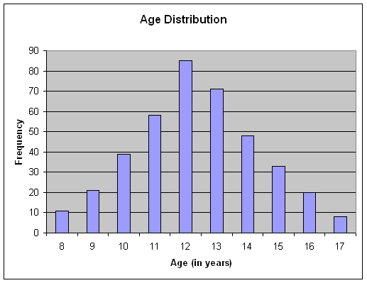
Histograms are bar graphs, which illustrate the frequency of a score or interval of scores by the height of a bar. The scores or intervals are indicated along the horizontal or X-axis, and the frequency is indicated along the vertical or Y-axis.
The histogram below is a graph of the frequency distribution data shown in the previous section. Histogram can be produced in a variety of ways. Most statistical analysis computer packages can produce such graphs. You can produce such graphs using statistical programs like SPSS for Windows, but you can also produce such graphs using programs that may already be on your computer. The histogram below (and the frequency polygon in the next section) were both produced using Microsoft Excel, which is part of the Microsoft Office package.
Frequency Polygons
The frequency polygon is an alternative way of graphing a frequency distribution. In the frequency polygon, a dot is placed above the score on the X-axis at a level to indicate the frequency of that score, and the dots are connected to form the graph as shown below. Frequency polygons allow you to see the shape of the distribution easily.
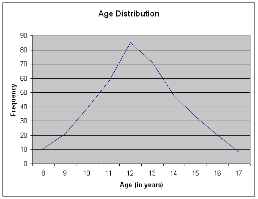
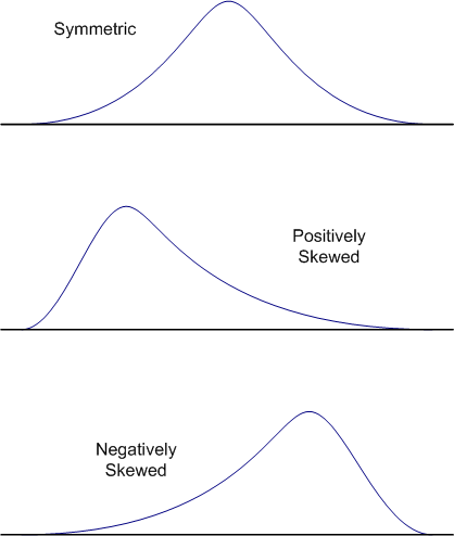
In the example shown here, the distribution is nearly symmetric. In a symmetric distribution, the right side of the distribution is a mirror image of the left side of the distribution. When the scores of a distribution tend to bunch up at either the top or the bottom of the scale, we say that the distribution is skewed. When the scores are bunched up at the bottom of the scale, we say that the distribution is positively skewed, and when the scores bunch up at the top of the scale, we say that the distribution is negatively skewed. This terminology is a bit counterintuitive. Think of the tail of skewed distributions as pointing in the direction of the skew. For example, a positively skewed distribution has the scores bunched at the bottom of the scale, but the tail points to the upper end of the scale (i.e., the positive direction), as shown in the figures below.
Scatter Plots
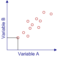
Scatter plots are a way of illustrating graphically the degree of linear relationship between two variables. A linear relationship means that the points of a scatter plot tend to cluster around a straight line.
Below is an example of a scatter plot. Each data point (circle) in the plot represents a person's scores on two variables. In our graph, we have labeled the variables A and B, and we have illustrated with lines drawn from the A and B axes how you graph a point. Note that these data points are not random, but rather seem to show a general tendency for the scores on Variable B to increase as the scores of Variable A increase. This produces a scatter plot in which the data points cluster around an imaginary line moving from the lower left hand corner of the graph to the upper right hand corner. This is a positive relationship between these two variable. The strength of this relationship can be quantified with a correlations coefficient, which we will be covering shortly. When we cover correlations, we will also look at how scatter plots illustrate the degree and nature of relationships.
Other types of Graphical Representations
You will learn later that there are many other graphical ways of representing data that help the reader (and yourself) to better understand the results. For example, you can use histograms or frequency polygons to show more than just frequencies.
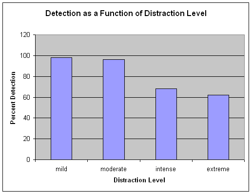
The graph below shows the mean scores of performance by four groups in a study of the effects of distraction on performance in a vigilance task. In this task, the person is to identify targets as they appear on a computer screen, and the score is the mean percentage of targets that were detected. Just glancing at the graph, you can see that people do remarkably well under conditions of mild to moderate distraction, but as the distraction increases, performance drops dramatically, with people missing a third or more of the targets when the distraction gets intense or extreme.
You will see later in our discussion, that we can modify graphs like this to show other aspects of the data in addition to the mean score, such as the variability of scores. However, we will postpone that discussion until you have had a chance to learn about variability and the statistics that are used to quantify the degree of variability.